
Diversity & Inclusion Course
A design system for talking about identity at work.
A full visual system and content architecture for a diversity & inclusion training course — translating academic research on identity, privilege, and workplace bias into an interactive e-learning experience and a set of long-form editorial infographics.
The Brief
The goal was to help organizations understand the importance of diversity in the workplace. To support a wide range of content, I created a flexible style guide and design system that brought together custom illustration, embedded video, and research-heavy material. The challenge was making a sensitive topic feel clear, thoughtful, and approachable without oversimplifying it.
Client
Google, Amazon
Focus
Diversity & Inclusion Training
Timeline
2018
Role
Design Lead

Process

Content Design
The biggest challenge was turning dense source material about concepts like Racial Identity-Based Impression Management, code-switching, and passing into something a non-expert could understand in under a minute. The project depended as much on information design as it did on visual design.
System-Building
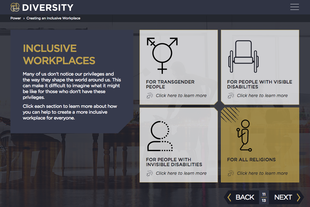
I created a custom icon system that represents different identities through details like hair and clothing texture without relying on caricature. A consistent navy, gold, and muted purple palette, along with a recurring angled-corner header treatment, tied everything into a cohesive visual system across surfaces.

Illustration Range
Some moments called for more than icons, so I also created fully custom illustrations that expanded the visual language while keeping the experience consistent.
The Course
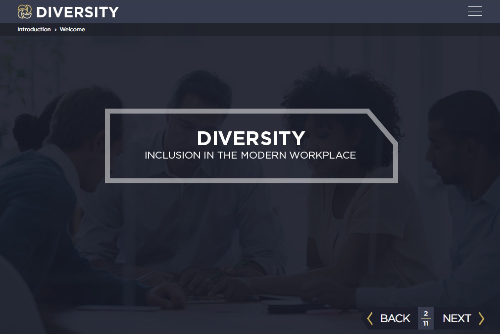
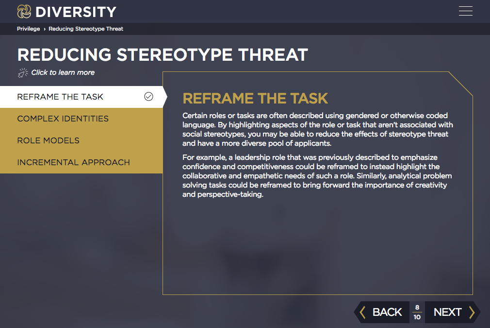
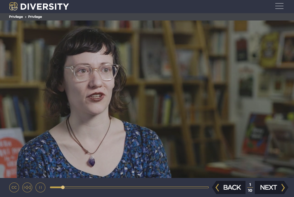
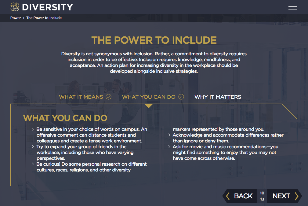
The course includes branching definition cards, an interactive icon grid, captioned video, and tabbed detail panels — all built on one consistent visual system.
Infographics
Four long-form editorial infographics turn research-heavy concepts like stereotype threat, privilege, identity, and structural inequality into clear, visual narratives.
Click any card to read the full piece.
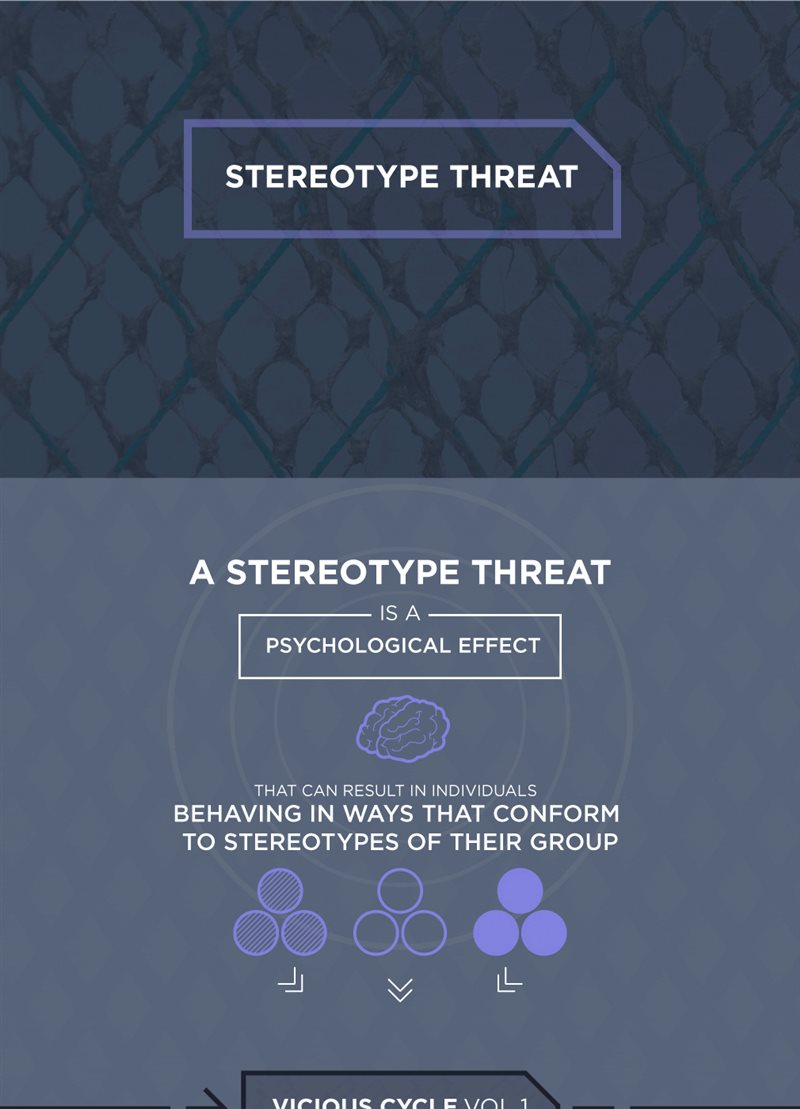
Stereotype Threat
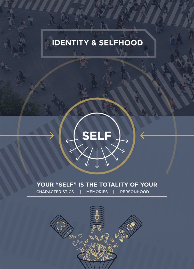
Identity & Selfhood
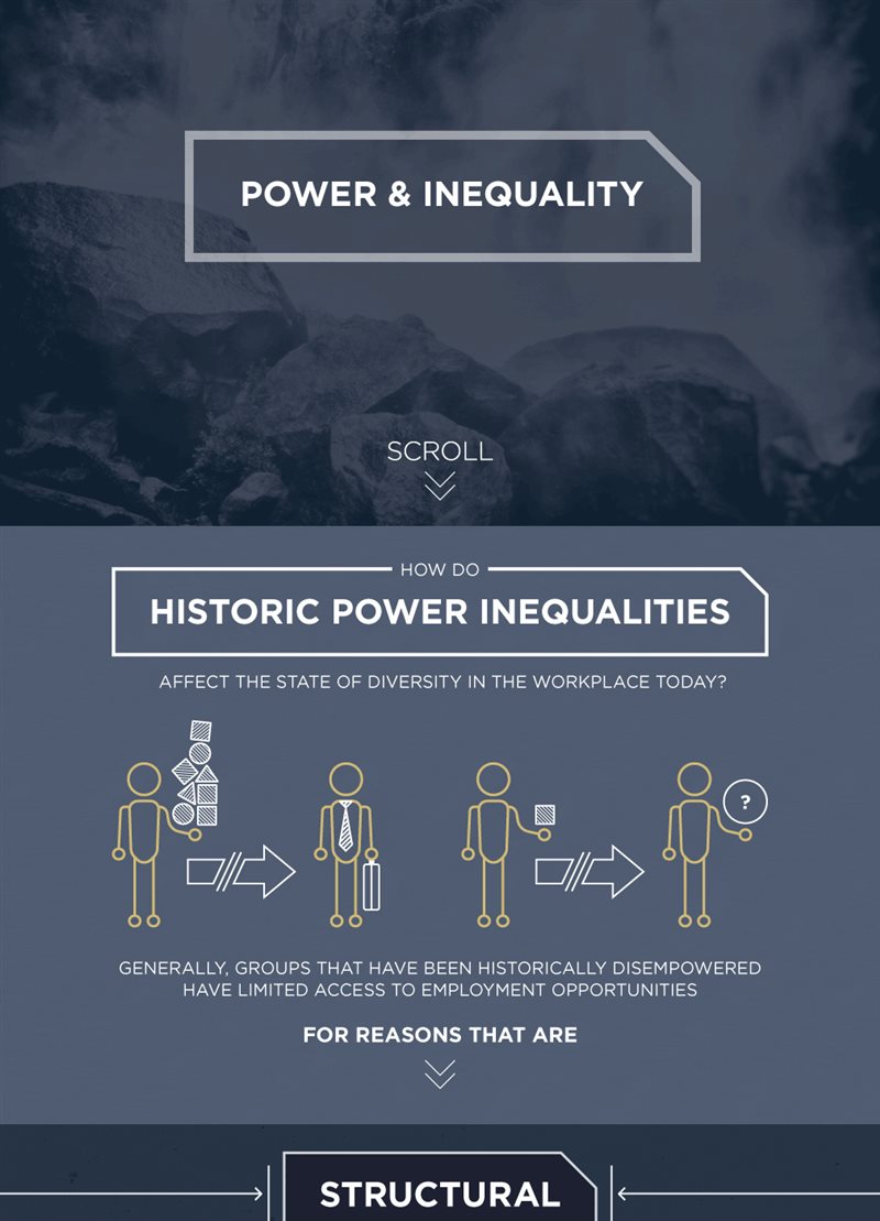
Power & Inequality
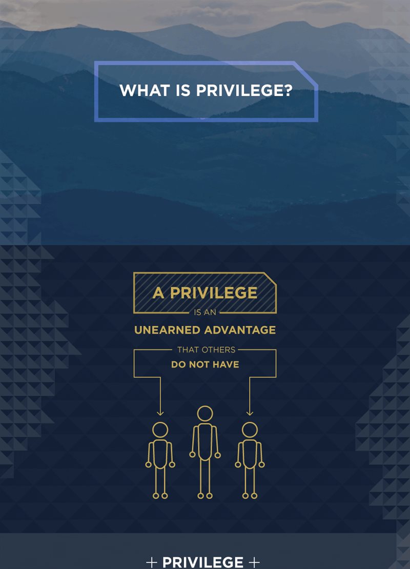
What is Privilege?
Reflection
This project pushed me further into content design and information architecture than anything I had worked on before. It challenged me to make sensitive, research-heavy material easy to scan without losing its meaning or nuance. Along the way, I also gained a deeper understanding of what it takes to create a more inclusive and diverse workplace.



