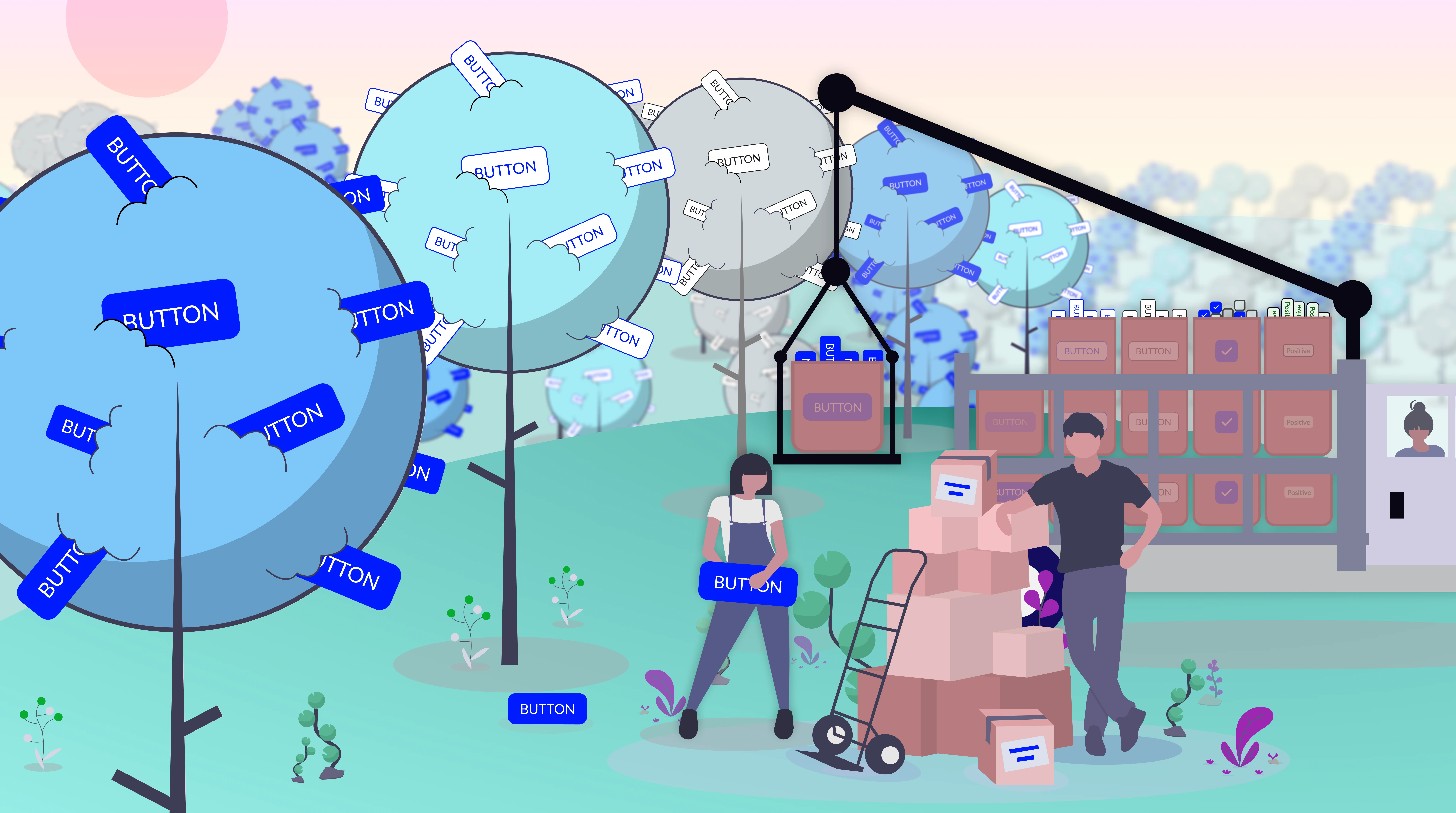
Procuring a Design System for the Supply Chain

UI Design
UX Design
Product Design

Context

When I joined iTradeNetwork at the start of 2020, the company had newly adopted a human centered approach to building products. We had a legacy suite of products that had a plethora of fragmented UI patterns and design decisions with no cohesion or consistency. My task was to build a modern design system that could control the chaos and provide a breath of fresh air to the organization.
Company
iTradeNetwork
Industry
Perishable Supply Chain
Timeline
2020-2021
Role
Lead Designer

The Industry

The perishable supply chain industry manages the end-to-end movement of sensitive goods requiring precise coordination, cold storage, and rapid transportation to maintain quality and safety. It relies on real-time data, logistics optimization, and strict compliance standards to minimize spoilage, reduce waste, and ensure products reach consumers in optimal condition.

The Company

iTradeNetwork is a cloud-based software company that provides supply chain management solutions specifically for the food and beverage industry, helping businesses manage procurement, logistics, traceability, and order workflows. At a high level, platform users were divided into two primary groups: buyers and suppliers.

Who is the system for?

There were two segments of personas to consider when building out the Design System: internal and external users.

External Users

Buyer
Responsible for sourcing perishable goods from suppliers and ensuring the right products are available at the right time, price, and quality. They manage contracts, monitor inventory levels, track shipments, and respond quickly to shortages or demand fluctuations.

Primary Focus: Forecast accuracy, on-time delivery, cost control, and minimizing out-of-stocks while protecting margins.
Supplier
Coordinate with farmers or producers to aggregate, price, and deliver perishable goods to retail buyers. They balance fluctuating yields, logistics constraints, and retailer commitments while managing inventory, fulfillment, and quality standards.

Primary Focus: Meeting contract obligations, reducing spoilage, optimizing distribution, and maintaining strong trading partner relationships.

Internal Users

Designer
Utilizing components and principles in Figma to generate wireframes to pass off to developers.
NEEDS
  • Component Library (UI Tool)
  • Style guide
  • Icon library
  • Principles
Developer
Following directions of wireframes and implementing code to build products.
NEEDS
  • Component Library (UI Tool)
  • Style guide
  • Icon library
  • Principles

Challenge

As the platform expanded, the lack of a unified design system made it difficult to scale new features efficiently. Teams frequently rebuilt components from scratch, slowing delivery and creating usability inconsistencies.The existing UI lacked accessibility standards, responsive rules, and a cohesive visual system, creating barriers for users and limiting the platform’s ability to evolve.
Product Suite
8
UI Patterns
0
UX Principles
0
User Satisfaction
25%

Constraints

Before diving into the design process, I aimed to fully understand the organization’s constraints so decisions could be made within the right context. Prioritizing efficiency and cost effectiveness was critical to ensuring success and maintaining confidence in the design team's efforts.
Set Budget
As a new team introducing a modern design process, we operated with a tighter leash and needed to quickly demonstrate our value by using the budget efficiently.
Offshore Development Team
While we had a small group of in-house developers, most of the team was offshore, making communication more challenging due to time zone differences and occasional language barriers.
Legacy Technology
Much of the tech stack and data infrastructure relied on legacy systems, resulting in inefficient UI patterns that users had grown accustomed to despite their limitations.

Product Management

For this project, we followed an Agile sprint planning methodology with two-week cycles, which added another layer of complexity to maintaining the design system documentation within Jira. In total, the design system was documented across three repositories: one for designers, one for developers, and one for product managers. To stay efficient, I managed my own Jira tickets and proactively communicated expectations with managers and teammates.

Process

With the organizational constraints in mind, the primary goal of the process was to deliver an effective solution as quickly as possible, without sacrificing clarity or scalability. Operating as a lean team with roughly 15 developers to every designer, it was essential to prioritize high-impact decisions, streamline workflows, and utilize open-source solutions.
Tool
Figma
Language
Angular
Sprint Cycle
2 Weeks
Des
Lead Designer

Approach

To keep development moving efficiently, we needed to stay roughly three months ahead with our wireframes, ensuring engineers always had clear, actionable direction. In parallel, the design system had to evolve even further ahead of the design work itself, allowing new components to be defined, validated, and rolled out systematically before being applied across upcoming features.

Open-Source Support

Utilizing free and pre-built resources was a key to the systems rapid development.
Google Fonts
Font-Families
Google Colors
Color palette and theory
Material Design
Component principles
Angular Javascript
Component documentation
AM Charts
Data-Vizualizations
Wijmo Grid
Data-Table/Grid
Unicons
Icon Library
UnDraw
Images Assets

Atomic Design Methodology

The success of the system relied heavily on a disciplined adherence to Atomic Design methodology, which provided a clear, scalable framework for building the UI from the ground up. I began by defining foundational elements and progressively expanded into more complex structures, including molecules, organisms, and ultimately full page layouts. This structured approach not only ensured consistency and reusability across the platform, but also significantly reduced the cognitive load on designers, enabling faster iteration and ideation.

Atoms

The most critical aspect of the system was establishing the foundational atoms that would serve as the building blocks for all subsequent components. I chose the atoms based on

Colors

Google Palette

Google provides an incredibly in-depth color palette with built-in accessibility standards that is perfect for rapidly developing products. I selected a distinct set of colors that would define the visual design for our product, and I added custom gradients to take the product to the next level.

Typography

Google Font: Lato

I picked one font for simplified typographical implementation and decision making then defined a hierarchy based on the golden ratio. I chose Lato because it was modern, worked at small sizes for enterprise accommodations, and it was a variable font. By leveraging variable weights and All Caps variations, all typographical needs could be achieved.

Spacing

8-pt Grid

Utilizing the 8-pt grid extremely enhanced the efficiency of crafting the components and guiding the other designers on how to build the system. Decision making was dramatically reduced and standards were more intuitive to define. The grid system also ensured consistency and order throughout the product suite.

Icons

Unicons

The Unicon library provided thousands of icons for free that could accommodate our distinct needs. I picked only the essential icons first and then slowly built up our custom library as needed. I also gave icons specific names and documented them thoroughly so there was no confusion in how to use each icon.

Image Assets

unDraw

unDraw provides a plethora of SVG assets that are perfect for enhancing the UI in areas such as empty states and splash screens. To make images more unique, I combined multiple assets to customize illustrations to help tell a story.

States

Interactions & Elevations

The final atom to define was how objects and components will behave when a User interacts with the live product. Borrowing concepts from Material Design, I defined “levels” within the products that would give the UI more depth and help Users understand what is more important to focus on.

Atomic in Action

After defining the Atoms, iterating on the compents was a streamlined task. The button was the first component to solidify as it was the most commonly occuring across wireframes. One action color was determined so that Users could quickly determine were to look within the UI.

Component Iteration

Iteration on components was made easy by leveraging the power of Figma. Once I established the base components, I would guide designers in adopting the library within their wireframes. I could make changes as needed then update the system to push iterations to all instances of the components. I started with the essential components, such as buttons, inputs, and checkboxes, then built out more complex organisms. To further improve efficiency, I created clearly named, standardized assets, enabling designers to quickly find what they needed and build features more effectively.

Solution

The system was successfully launched within three months and continued to evolve, reaching version 1.0 by the end of the year. While there were minor setbacks along the way, each challenge provided valuable insights that strengthened the process. Ultimately, the initiative significantly improved the company’s ability to deliver products and features more efficiently.
Components
254
Styles
173
Icons
198
Productivity Increase
300%

Success Metrics

To evaluate the impact of the design system, I tracked key metrics focused on workflow efficiency, development consistency, and team productivity.
Wireframe Construction
Prior to the system, designers built wireframes from scratch, relying on loosely defined UI patterns. With the system in place, they were able to start at a higher fidelity and iterate up to 3x faster.
Development Consistency
Previously, developers worked in silos, resulting in inconsistent, ad hoc implementations. The design system introduced a centralized source of truth, with a dedicated team maintaining a shared codebase aligned with Figma components, dramatically reducing unnecessary cost for code.
Documentation & Adoption
To ensure consistency and reduce dependency on ad hoc support, I created comprehensive documentation with usage guidelines and live code snippets, enabling teams to implement components with greater clarity and autonomy.

Design System v1.0

The final version of the system was delivered as version 1.0 and covered the needs of the entire product suite. The system lived in three environments: Figma, a proprietary repository, and documented in a custom website.

Interactive Figma Prototype

Review the system one component at a time.

Component Demos

The following examples showcase some of the larger organisms of the system that provided the highest impact.

Product Navigation

The primary navigation of products was fixed to the left of the screen and could be expanded or collapsed to save on UI real estate.

Sorting Cards

These custom cards quickly sorted the data, a task Users frequently wasted time on daily.

Data Tables

Data Tables could be expanded to fill the screen, reordered according to User's specifications, and filtered. We leveraged Wijmo Grid to support with logic.

Figma Library Demo

The following examples demonstrate how the system worked within Figma. Users could easily drag & drop components from the asset library into their working spaces.

Buttons

Inputs

Screen Examples

The system successfully created visual consistency as well as added elegance to our product suite. Our Users, and executives, were very pleased with the results of the system and were excited to see changes made after years of working with legacy UI patterns.
Sign-in screen
Sign-in Screen
Data table with sorting cards.
Data Table with Sorting Cards.
Purchase Order screen.
Purchase Order
Widget drilldown screen.
Widget Drilldown
Widget drilldown with user contact drawer.
Widget Drilldown with user contact drawer.
Widget configuration screen.
Widget configuration with tooltip.

Final Takeaways

I learned so much from this project, and while it’s difficult to distill everything into a few points, these are the key takeaways I would carry forward into building my next design system.
Invest in systems that scale clarity
Early and consistent documentation, standardized wireframe organization, and thoughtful communication patterns significantly reduce friction, improve team alignment, and accelerate adoption across cross-functional teams.
Design for collaboration
Tailoring workflows, especially developer handoff and team conventions, to real human behaviors and preferences leads to stronger collaboration, fewer misunderstandings, and more efficient execution.
Balance speed with structure
While rapid iteration is critical, maintaining guardrails, such as controlled access, standardized assets (like icons), and simplified communication, prevents chaos and ensures the system remains sustainable as it grows.

Thank you!

Thank you for taking the time to learn more about my work.

Get in Touch →