Turning overwhelming operational data into a modular analytics dashboard for enterprise buyers who move $2.4B+ in perishable products yearly.


Supply chain operations generate large volumes of real-time data (inventory, shipments, contracts, pricing, quality metrics). The interface needed to simplify complexity without oversimplifying critical information.
The product relied on existing ERP and supply chain infrastructure. Design decisions were constrained by available data structures, API limitations, and technical feasibility.
Because perishable goods are involved, delays have immediate financial consequences. The interface needed to prioritize urgency and exception management over passive reporting.
Users were accustomed to spreadsheets and legacy dashboards. The new solution needed to feel modern while minimizing disruption to established workflows.
Before designing anything, I set four criteria the dashboard had to meet:
Users identify their top-priority issue within seconds of landing, without exporting anything.
Fewer spreadsheet exports and less time assembling reports by hand.
Sustained daily use across both buyer and supplier accounts, not a one-time login.
Measurable downstream improvement in fulfillment with fewer late shipments and less spoilage.
The first step to building the product was to scope an MVP that solved our User's problems and was an easy task for our Developers to implement. The target was to launch the MVP within 3 months.


The clearest example of how this dashboard was designed is the Commodity Price Index widget. I iterated intially based on direct user feedback that aligned with developers based on technical constraints.
We discovered that the users referenced data tables constantly to understand their supply chains.

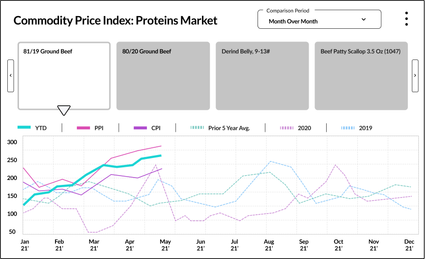
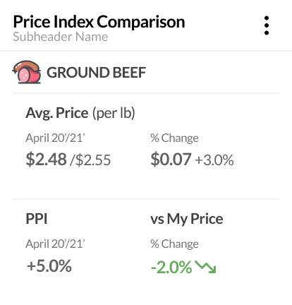
My first idea with the widget was to surface the data for each individual product within a commodity family, with controls and toggles to enable data manipulation without needing to change views.
"This data visual is on the right track, but nothing else is. I need to be seeing much more specific data other than a cool visual. I really just need one metric at a high level, then all these data points can be tertiary, but I still need them for executive summary reports."
After removing all the secondary information there was much more space to work with. Before I focused on the visual aesthetic of the widget and wasted time, I wanted to ensure that the metrics being surfaced were exactly what the User wanted to see.
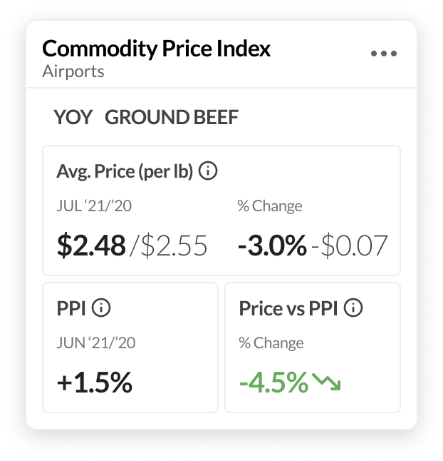
"Alright, now this is more helpful, I really only care about the high-level metrics and how I am doing compared to the rest of the market. As long as the data visualization and explicit data connected to the widget are available then this is close."

For this round, I finalized the technical aspects of the widget such as which KPIs to surface and what size to make the widget, which informed what size to make all the widgets. Additionally, we learned that the comparison period of prices was critical to the value of the dashboard to our users.
"I want to be able to toggle the comparison period of the data. If that is possible then this iteration is exactly what I want to see."
One thing I learned about our tech stack is that including things like images and icons within widgets significantly reduced load times. I also had to understand in depth how metrics were calculated.
"Including icons will be difficult because we would need an extensive library of data calls to our backend that will lower usability of the product. Additionally, we will need the technically specifications for the drilldown counterpart of the widget and how these KPIs are calculated."
The final widget included more math and technical specs than I initially anticipated. The key win with this widget was understanding that widget should be as minimal as possible then all data can be included in the drilldowns.
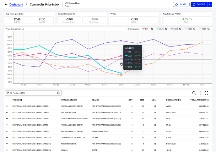
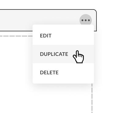
The final key decision was to build with a desktop first mentality, a counter intuitive philosophy to modern day product design trends. However, with research we determined that 100% of our users performed their tasks on Desktop or Laptop environments. The primary component that every User asked about was what the spread sheets and export functionality would look like.

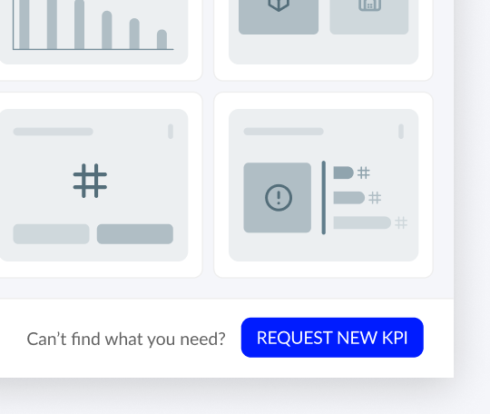
Surfaces the total of a custom KPI such as spend on meat, number of distribution centers, or products in a catalog.

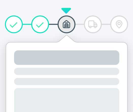
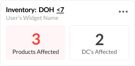
After configuration, the user can monitor the number of products that will soon run out in and at which distribution centers.
Aggregates all active savings documents of a preferred type and highlights the time remaining.

Tracks all active purchase orders that have not been confirmed by the supplier.

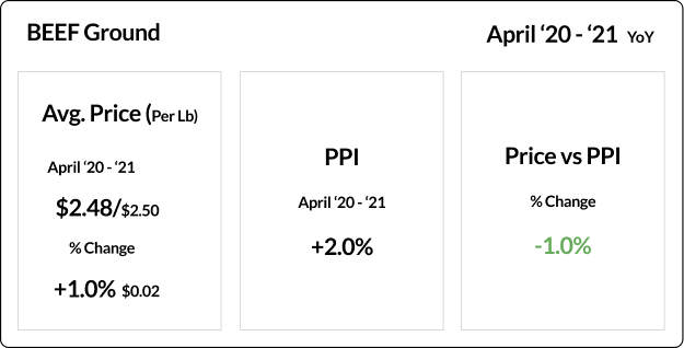
Compares the user’s current product pricing to the Producer Price Index (PPI) and the prior year’s price. Paying less than the PPI is the goal.

Analyzes the user’s product catalog to surface potential missed opportunities on savings on products that are not rebated.

Surfaces the top 5 statistics of a configured category. Full results available in the drilldown.

Displays the total variance on contracts that need to be resolved by the suppliers. The total should ideally be a $0.


Our biggest advantage was deep insight into users’ daily workflows. By partnering closely with Subject Matter Experts, we were able to break down the complexities of the perishable supply chain and cut through dense industry jargon, leading to more informed, user-centered decisions.
Focusing on a Minimum Viable Product allowed the team to move quickly and iterate with purpose. By validating core features early, we built confidence in the foundation of the dashboard and created a clear path for expanding functionality.
Some of the most valuable sessions came from live sketching with users, PMs, and developers. Even without formal design training, their contributions brought fresh perspectives that directly elevated the quality and usability of the product.
